
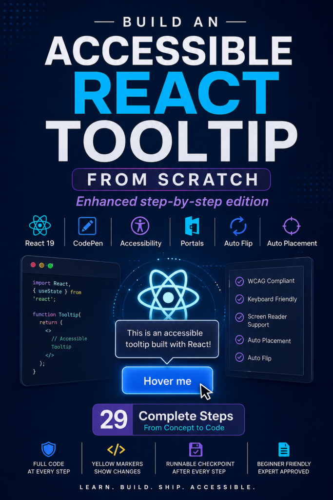
- 29 progressive steps from CodePen setup to a complete accessible React tooltip
- Built with React 19 and CodePen
- Complete runnable JavaScript checkpoint after every step
- Keyboard accessibility, ARIA semantics, and Escape-to-dismiss support
- React Portals and real DOM measurement for reliable positioning
- Four placements with viewport-aware positioning
- Auto Flip and Auto Placement for intelligent tooltip positioning
- Final copy-paste component with complete CodePen panels
- Price Free
- Sections 3
- Steps 29
- Format PDF
Table of contents
- How This Enhanced Edition Works 2
THE STEP-BY-STEP JOURNEY
- Step 0 — CodePen Setup 3
- Step 1 — Create the Smallest Possible Tooltip 5
- Step 2 — Show the Tooltip Only on Hover 6
- Step 3 — Remove the Wrapper Problem 7
- Step 4 — Preserve Existing Event Handlers 8
- Step 5 — Mouse Is Not Enough 9
- Step 6 — Support Escape to Dismiss 11
- Step 7 — Add Tooltip Semantics 13
- Step 8 — We Need Access to the Real DOM 15
- Step 9 — Render the Tooltip in a Portal 17
- Step 10 — Measure the Trigger 19
- Step 11 — Add Four Placements 21
- Step 12 — Keep the Tooltip Inside the Viewport 23
- Step 13 — Recalculate on Scroll and Resize 25
- Step 14 — Make the Tooltip Hoverable 27
- Step 15 — Store a Timer in a Ref 29
- Step 16 — Let the Tooltip Cancel the Close 31
- Step 17 — Understand Why Clamping Is Not Auto Layout 35
- Step 18 — Measure Available Space 38
- Step 19 — Determine How Much Space We Need 41
- Step 20 — Add Auto Flip 44
- Step 21 — Add placement="auto" 47
- Step 22 — Requested Placement vs Actual Placement 50
- Step 23 — The Final Positioning Pipeline 53
- Step 24 — Final Complete Component 56
- Step 25 — What Each React Feature Is Doing 59
- Step 26 — The Final Architecture 62
- Step 27 — Important Concept: React vs the Browser 66
- Step 28 — Accessibility Boundary 69
APPENDIX
- Appendix — Final CodePen Panels 72
- HTML
- CSS
- JavaScript (Babel)
- Final complete component
About this ebook
BUILD AN ACCESSIBLE REACT TOOLTIP FROM SCRATCH
Learn how to build an accessible, dynamically positioned React tooltip from the ground up using React 19 and CodePen.
This enhanced step-by-step edition walks through 29 progressive steps, from creating the smallest possible tooltip to building the complete component with keyboard accessibility, Escape-to-dismiss behavior, ARIA semantics, React Portals, DOM measurement, viewport-aware positioning, Auto Flip, and Auto Placement.
Every step includes a complete cumulative JavaScript checkpoint so you always have a runnable version of the component. Code introduced or structurally changed in each step is clearly marked, making it easy to understand exactly what changed and why.
You will also learn how React state, refs, events, effects, portals, and browser geometry work together to create a practical floating UI component.
By the end, you will have a complete copy-paste React tooltip component and a clear understanding of the architecture and positioning pipeline behind it.